Avoid copy bias
Don't repeat the weak points of the old software or competitors due to lack of proper research.

Summary
Context
GTEEX is an agribusiness technology company that for a long time relied on third-party software to operate and configure its spraying drones. The time came to break free and develop their own drone control, for larger drones with greater payload capacity and GTEEX's own identity. It was time to build a 100% autonomous system.
My goal went beyond creating beautiful screens: we needed to organise a large volume of configuration data into an intuitive interface for pilots in the field.

Problem
Before any decision, I needed to understand the reason behind each change — I needed evidence before doing or not doing something. So to plan this complex interface, I had to ensure, before touching a single screen:
Don't repeat the weak points of the old software or competitors due to lack of proper research.
Don't abandon efficient solutions just in pursuit of a purely visual change.
Uncover friction pilots experienced day-to-day that never reached GTEEX's technical support.
Approach
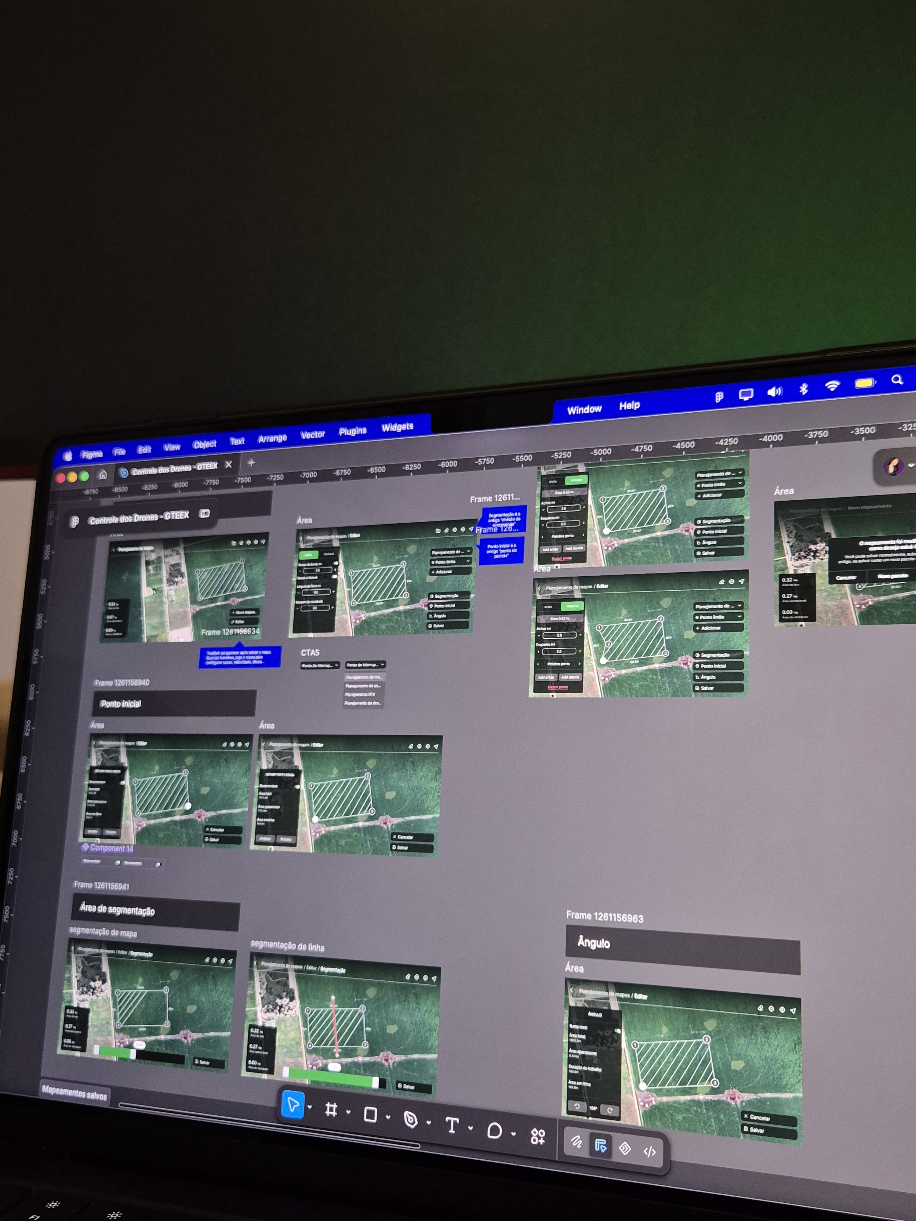
Designing a system with 100+ screens in Figma demands organisation, so I mapped the previous architecture to ensure nobody would "get lost" mid-process. It was extensive, but became a solid foundation — reorganising information only makes sense after you understand exactly where it is and why it's there today.
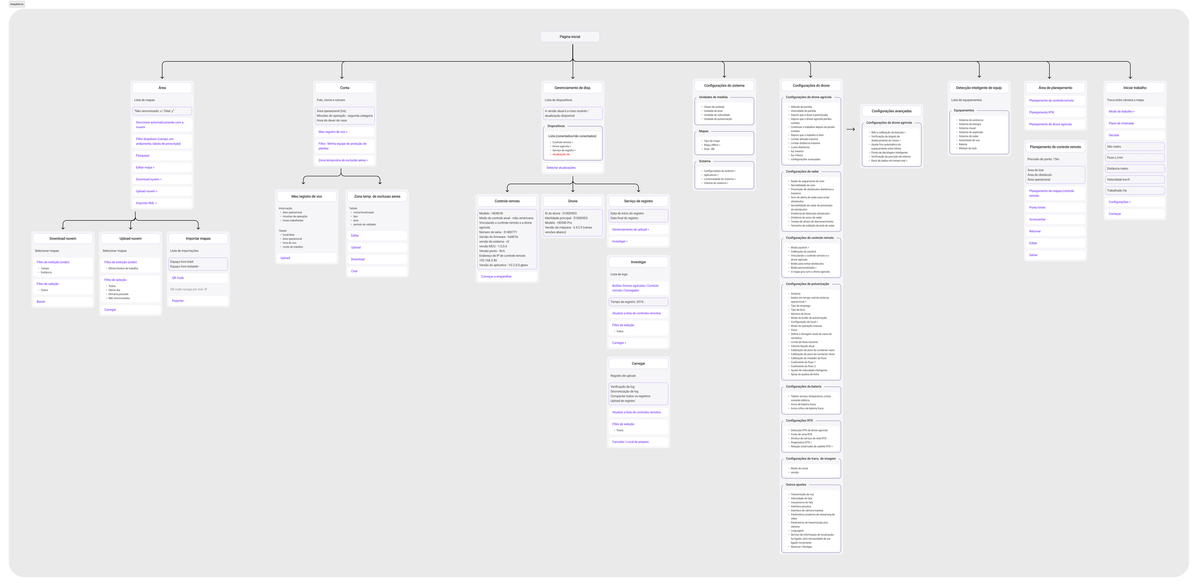
At the end of the project, I was able to summarise the essence into six pillars:
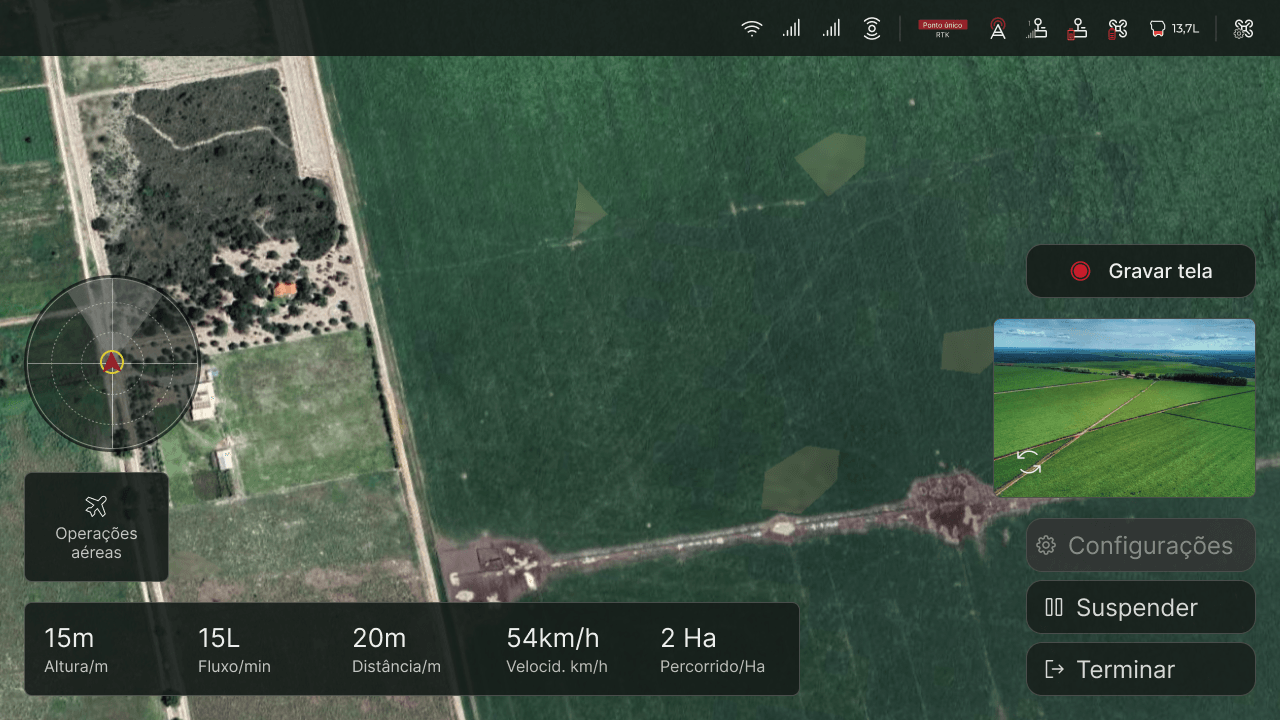
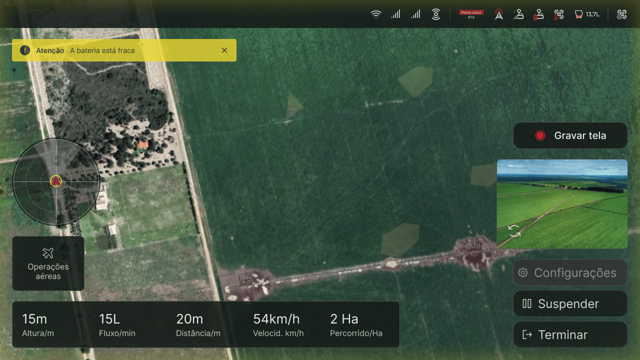
The live piloting screen. Centralises the drone route, telemetry data, and quick management of crisis alerts (such as low battery).
Where the pilot creates routes from scratch, imports areas via QR code, and defines settings such as edge offset, limit point, unilateral offset, strip width, obstacle margin, segmentation, etc.
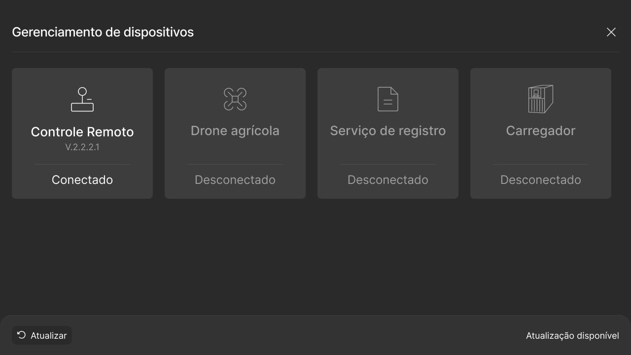
Manages the status and health of all physical equipment connected: the controller, drone, chargers, and batteries.
Covers default definitions such as displayed units of measure, map types, and system adjustments.
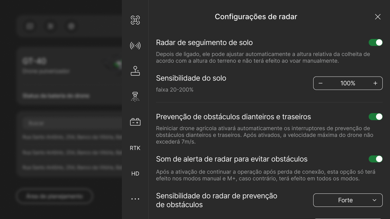
Where the most technical adjustments live, such as obstacle radar sensitivity, RTK calibration, and spray nozzle flow rate.
Where the user manages their profile, accesses past flight history and logs, and views temporary no-fly zones.
Approach
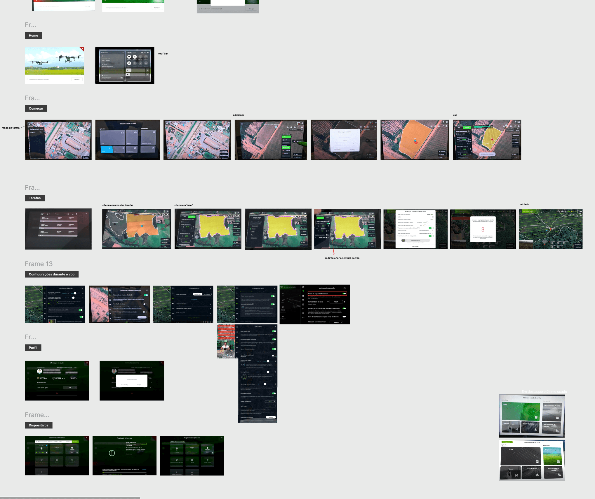
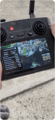
I studied one of the most widely used interfaces on the market — the DJI Agras T40 — watching and mapping videos, screenshots/photos, and the physical controller's lights and buttons. I mapped as much of the interface as I could, by screen category: login, controller activation, authentication, environment setup, connectivity alerts, home, flight start, RTK settings, etc.
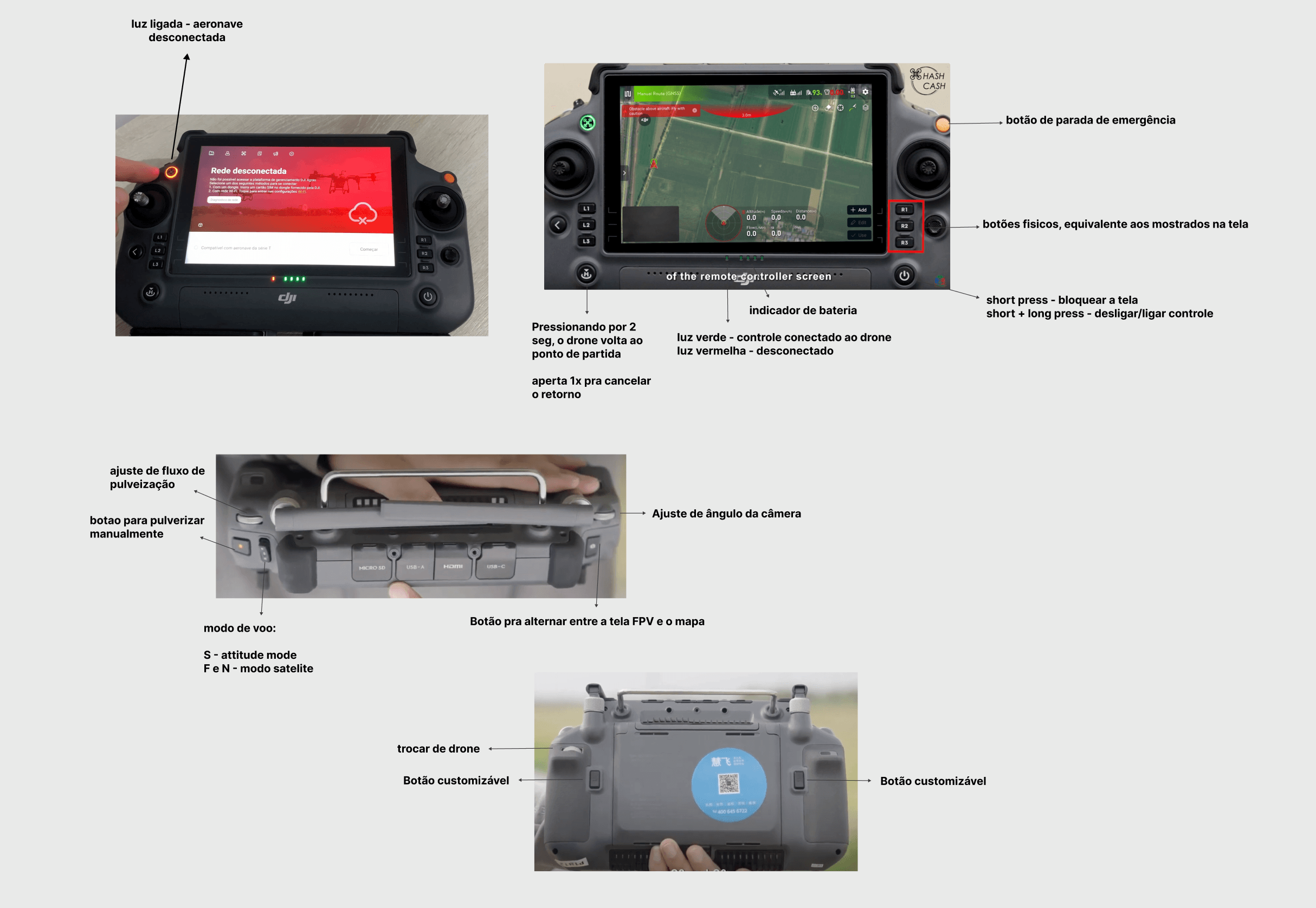
I understood what was better organised in the competitor and, at the same time, realised that the software used by GTEEX was already aligned with what the market was used to in many respects. We were on the right track regarding features and configurations.
Approach
I interviewed pilots with the goal of finding real difficulties, prioritising those who had been using the controller for some time and those who had stopped. One pilot, with five years of industry experience, pointed out the GTEEX radar screen as superior to DJI's and XAG's, but revealed that a contact of his had decided not to buy because he believed there was no mapping integration with other drones.
The worst part? It's not true.
The feature exists — it just wasn't findable. Another issue of the same kind: another pilot mentioned wanting to record the screen while flying, since he considers the camera decent enough and would like to show his employer. However, that feature also exists, but was hidden in the device settings.
Another interviewee — one of the first GTEEX pilots in Bahia — described the interface as "simple and no-frills", but criticised it saying the only flaw was that the controller overheats, freezes, needs restarting, and leaves him disoriented during night flights.
A contact of his decided not to buy because he believed there was no mapping integration with other drones — but the feature exists, it just wasn't findable.

The GTEEX software's radar screen was praised and considered superior to DJI's and XAG's.
One pilot wants to record the screen during flight but believes it isn't possible.
Approach
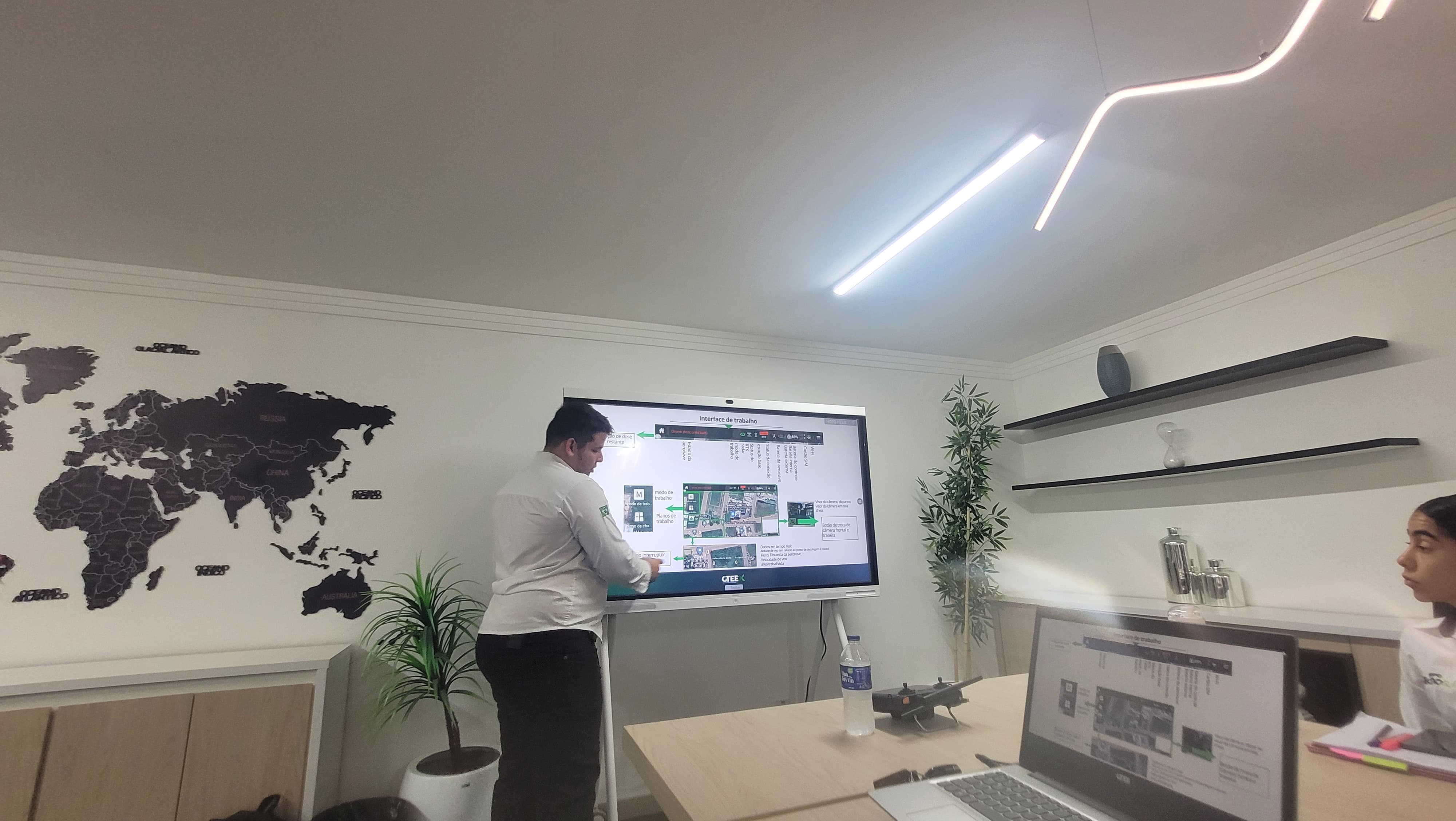
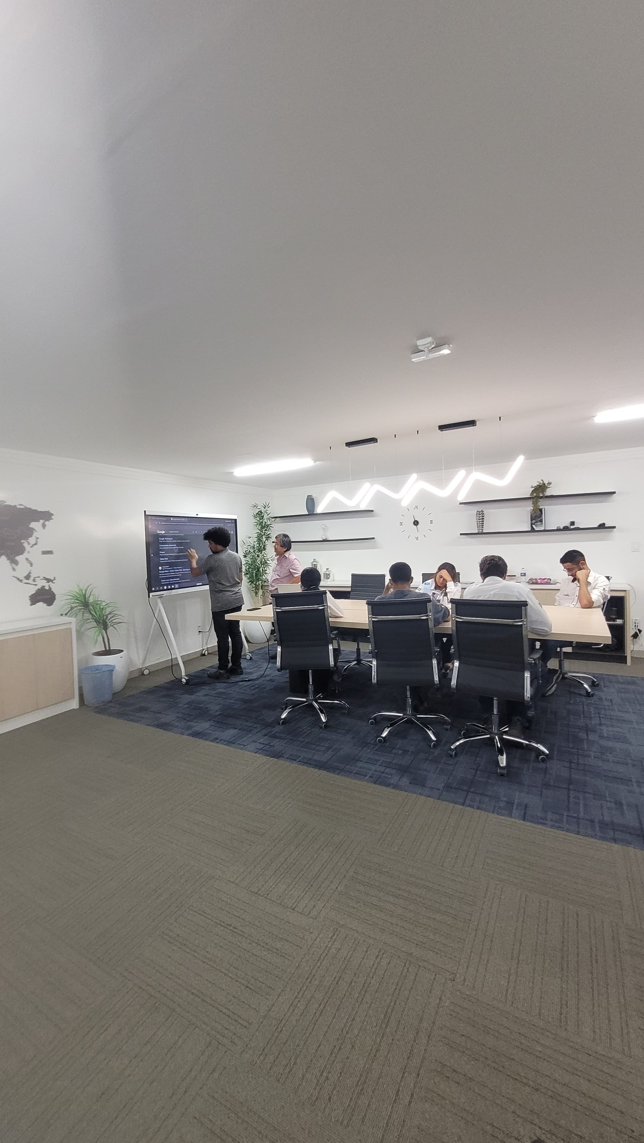
The pilot's perspective alone wasn't enough. Before, during, and after user research, there were numerous meetings with the hardware development team — the people who truly had direct hands-on experience with the physical controller — and the pilot training team in the field, who know the drone's and pilots' needs first-hand.
With them I validated what made sense to keep and what should be cut in the new version. Listening to those who build and use the product isn't just good — it's essential!
Approach
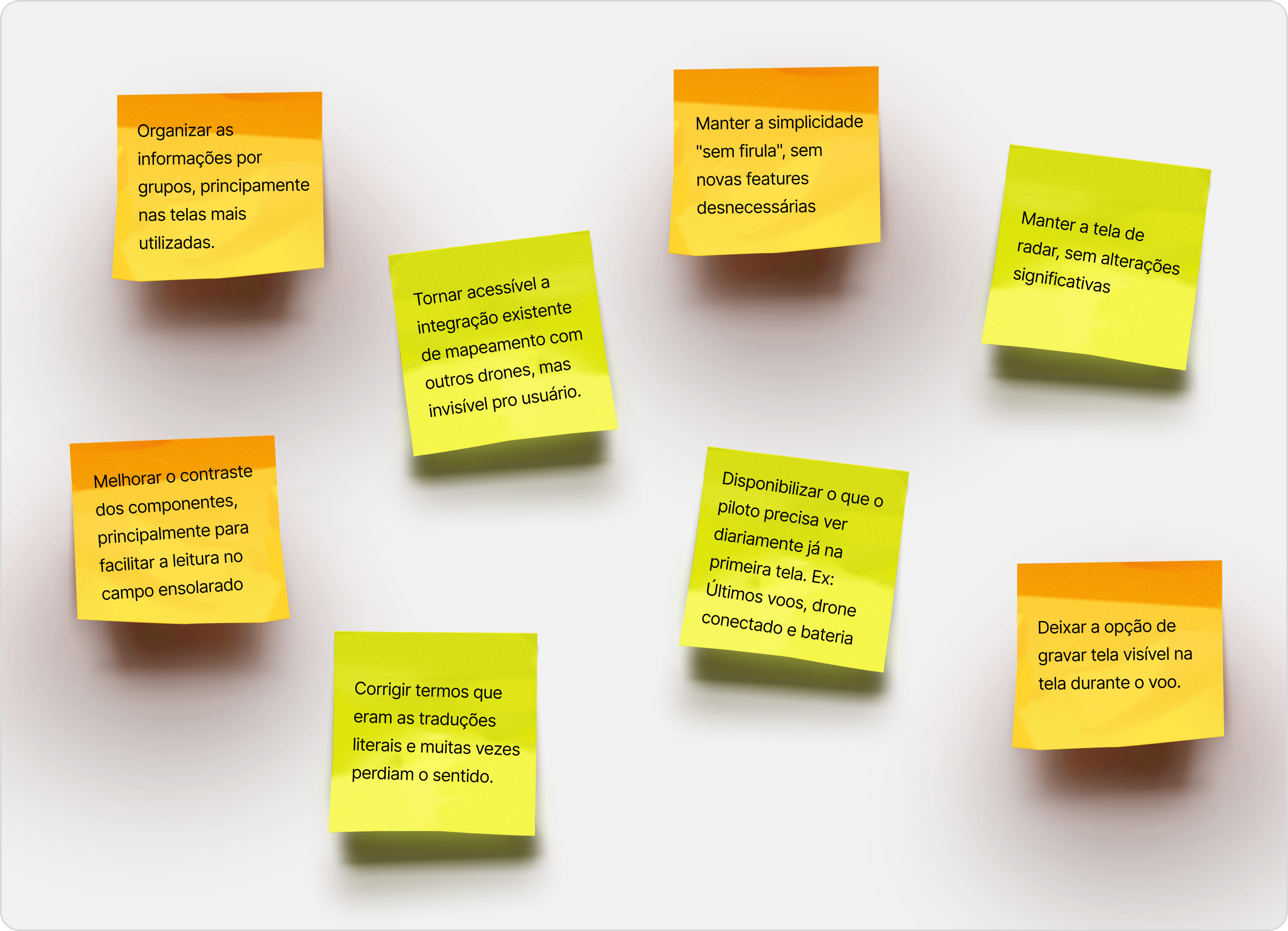
Combining netnography, competitor analysis, interviews, the current architecture, and alignment with the hardware team, several insights emerged for the redesign:
Approach
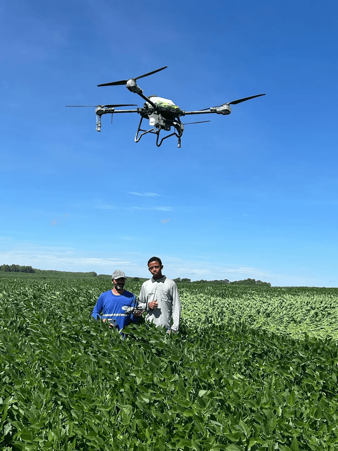
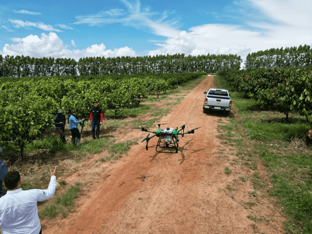
In a 200 ha area operated by a 100 L drone, repetition is part of the routine. In soy cultivation in Brazil's Centre-West and MATOPIBA regions, an average of 8 to 10 applications are made during a 4–5 month cycle, each lasting about a week. In practice, this means the pilot follows the exact same spraying path multiple times a day. Having to re-start/configure the same route repeatedly is an unnecessary burden.
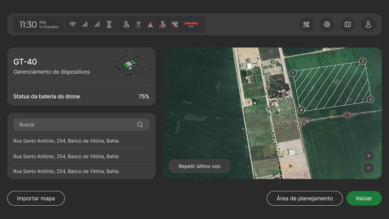
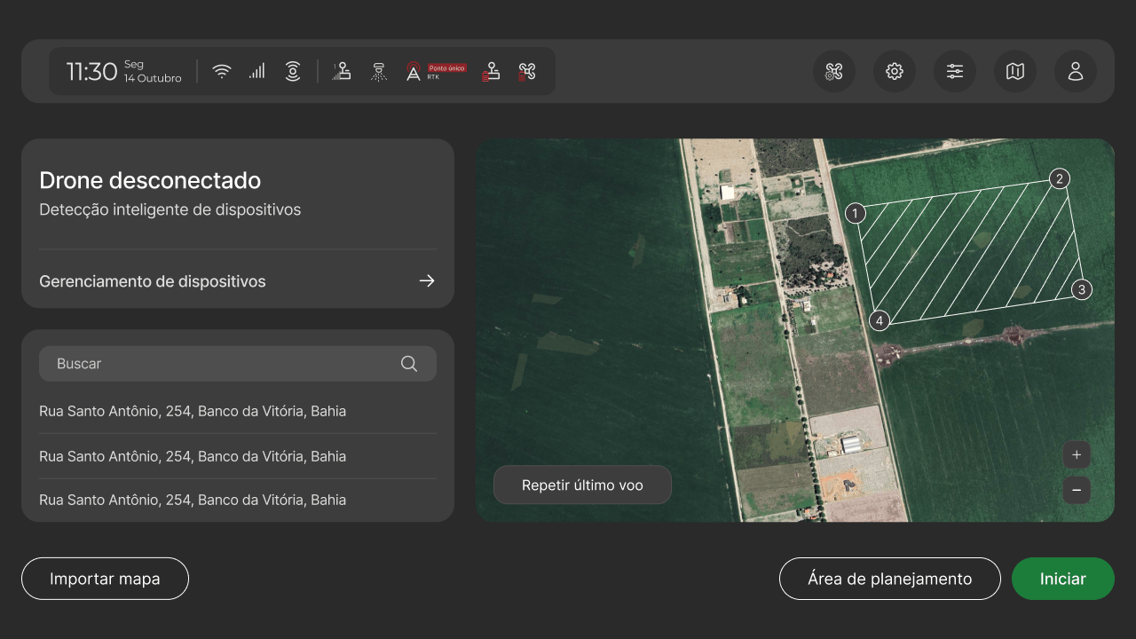
Starting from this context, I designed the initial dashboard focused on displaying the most relevant information for continuing the operation:
Another frame gathers other searchable flights and maps, without requiring deep navigation to reach them. For pilots who repeat the same route every day, this eliminates the cost of re-finding what is already a daily work routine, and anticipates the next action.
Approach
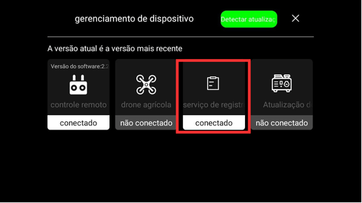
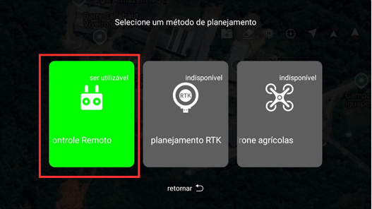
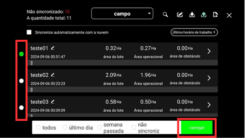
Most buttons had low-contrast text, making them hard to read
Most CTA buttons had contrast so poor they were practically illegible. This becomes more concerning when you understand that the usage environment is an open field under sunlight — very bright conditions. Fixing this was essential to ensure pilots can properly read information on their tablet or phone screen even in bright light, without needing to find shade to work.
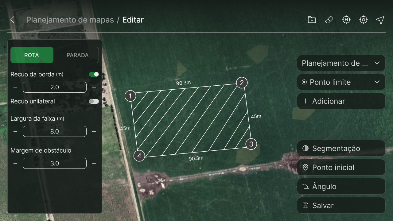
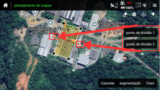
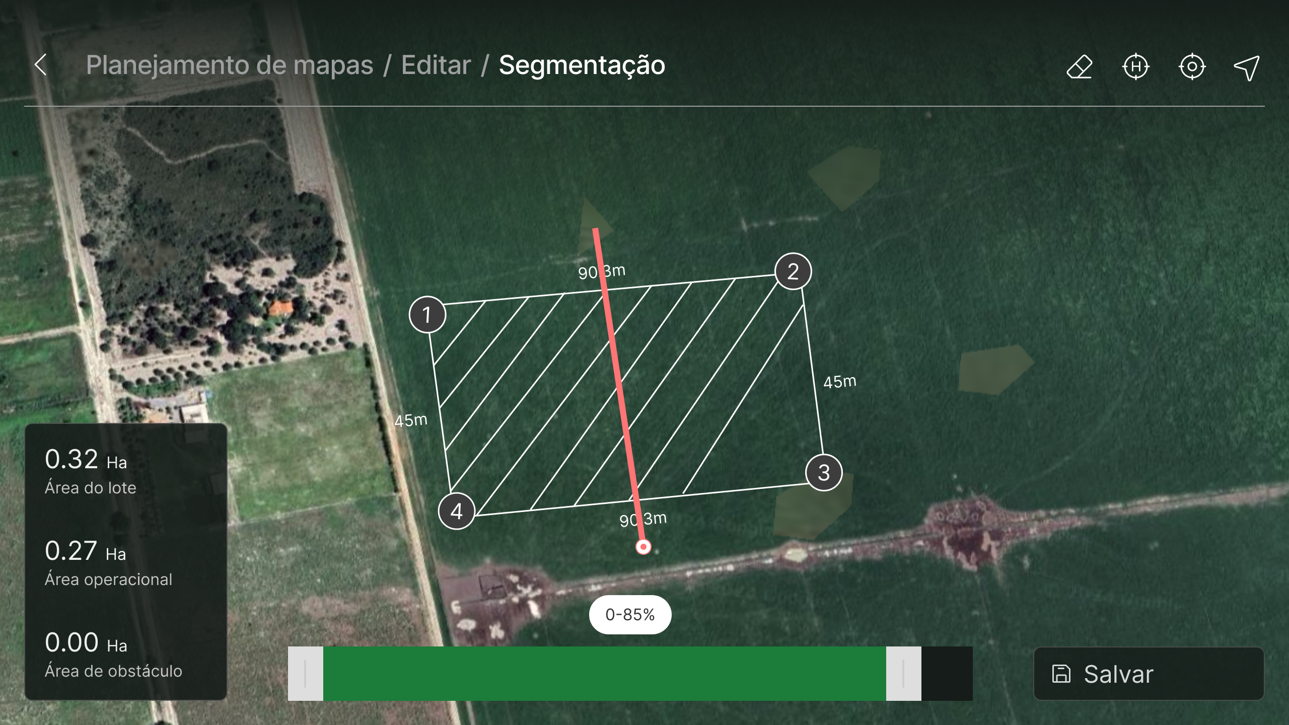
Beyond colour contrast, there was also a terminology/naming problem — likely caused by translation errors in the software. To reduce the effort of decoding unfamiliar vocabulary and shorten the learning curve, I replaced confusing terms with familiar ones. For example:
 New mappingSegmentation
Approach
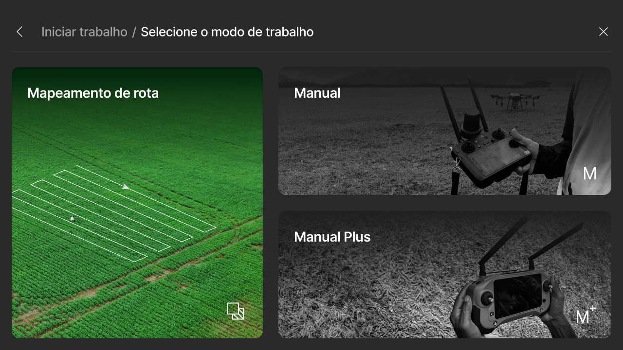
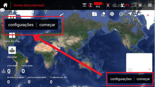
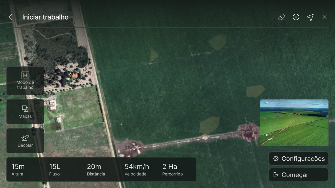
On the "Start work" and "Work mode" screens — the most accessed in daily use — information seemed visually scattered across the screen, in a disordered way.
I reorganised the layout into blocks, grouping related data within each. This makes it easier to separate distinct functions and allows the pilot to read and locate a piece of data more quickly.
On the segmentation screen, I added a bar at the bottom to choose the size of the area to be segmented — a feature other brands already offered that GTEEX didn't yet have. The bar reduces the manual adjustment work and brings the experience closer to what the market has already popularised.
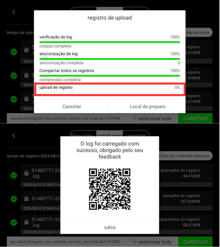
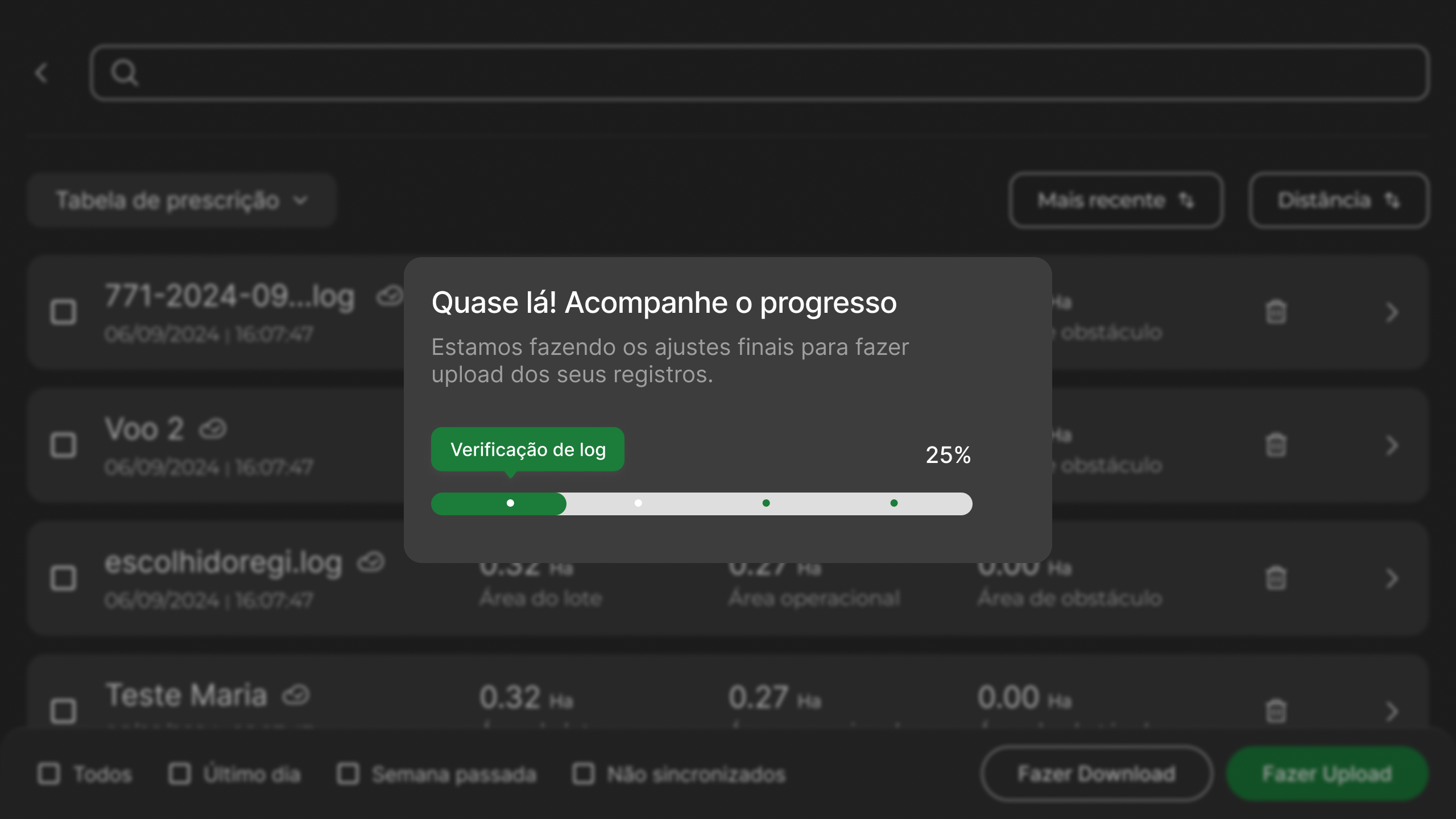
On the mapping download/upload screen, there was visual pollution from four stacked progress bars. The language was also unnecessarily technical and contained poorly translated terms, as mentioned in the previous section (e.g. "complete check" for "check complete").
The overall progress was confusing and prone to doubts about the real status of the operation, as loading/feedback up to 100% occurred in multiple intermediate steps.
To fix this, I defined a single progress bar to convey predictability and control, and the process steps are subtly indicated by dots (milestones). I also used a more empathetic, informative tone of voice to manage user expectations and waiting anxiety.
Approach
During interviews, I identified two essential features already in the ecosystem but hidden in the interface, causing everything from lost sales to operational frustration for pilots.
I discovered the company had lost a sale simply because a potential customer believed GTEEX didn't accept maps generated by other brands' drones. The feature existed, but was so hidden in the old structure it seemed not to exist at all.
To eliminate this commercial objection at the root, I created a map import button/shortcut right on the initial dashboard, where the pilot sees basic information before starting flights. Now, when accessing the controller, it's clear the system is compatible with the market.
Another account worth addressing was a pilot who wanted to record the GTEEX controller screen during operation (to show his employer), but believed it wasn't possible.
To make recording accessible — previously buried in the Android toolbar — I added a dedicated "Record Screen" button integrated directly into the live flight interface. The pilot no longer needs to search the system; with just one tap on the screen during flight, recording starts instantly without losing focus on the drone.
UI Design
Impact
The success of the GTEEX controller redesign was measured by our ability to give clear answers to the pain points mapped at the start of the project. Looking at the finished product, the impact falls into three main areas:
Adding the map import button to the dashboard resolves one of buyers' objections — not knowing a feature existed. A hidden feature is a non-existent feature.
By aligning the interface nomenclature with the established vocabulary of the agricultural market, we reduced the time and friction for new users.
The most important data sits at the top of the hierarchy and the UI was broadly reorganised by similarity, findability, and improved visualisation.