Turning traffic and sales data into clear decisions
LAUNCHED
2024
Product Designer
Web Interface
Figma · Google Meet
TL;DR
Summary
Context
B2B web platform for traffic and sales analytics, focused on traffic managers, info-product creators, and entrepreneurs.
Problem
Data overload in traditional platforms causes confusion and makes decision-making harder, especially for less technical users.
Approach
I conducted user research and market analysis to map priorities, grouped similar data, and created a dashboard focused on key metrics, guided onboarding, and actionable data.
Impact
Reduced visual complexity, turning a panel of dense tables into an active revenue-recovery and real-time performance diagnostic tool.
1 clickTo recover lost sales
+ AccessibleFor different user types
01 / 09
Context
Context
Traffic and sales data in a single platform
Ubitracker is a web platform for traffic and sales analytics designed to help traffic managers, info-product creators, and entrepreneurs track campaign performance, centralising metrics in one environment.
It doesn't just analyse — it records and reactivates sales opportunities, aiming to serve users with varying levels of data familiarity.
02 / 09
Problem
Problem
Lots of data, but little clarity or decision-making
The product's core challenge was delivering value: how to turn numbers into real, intuitive sales opportunities? For users with varying data familiarity, the complexity of simultaneously analysing multiple campaigns, channels, and conversions had become a barrier.
The three main challenges to designing a good experience and retaining users were:
01
Design an accessible experience that reduces the level of complexity.
02
Structure the product in a clean, functional, and intuitive way.
03
Turn data into executable actions, not just numbers.
03 / 09
Approach
Approach
I started with a few interviews and meetings
To understand where current tools fall short and which metrics truly move the business needle, I conducted remote interviews (via video call and messages) with paid traffic managers and professionals running active performance campaigns.
The goal was to map these users' real behaviour: what do they look for first when they open a platform? How do they prioritise information? I found that one of the key objectives goes beyond seeing what's going well — they want to find the errors to stop the bleeding.
Observation 1
The sales funnel was the highest-relevance data point for users, followed by general performance data, engagement metrics (such as CTR and clicks), and finally financial reports.
Observation 2
Viewing the funnel helps users identify where leads drop off in the journey and optimise campaigns based on conversion rates between stages.
Observation 3
CPL, CPA, Conversion Rate, and ROAS were cited by participants as the most relevant metrics for decision-making.
04 / 09
Approach
Approach
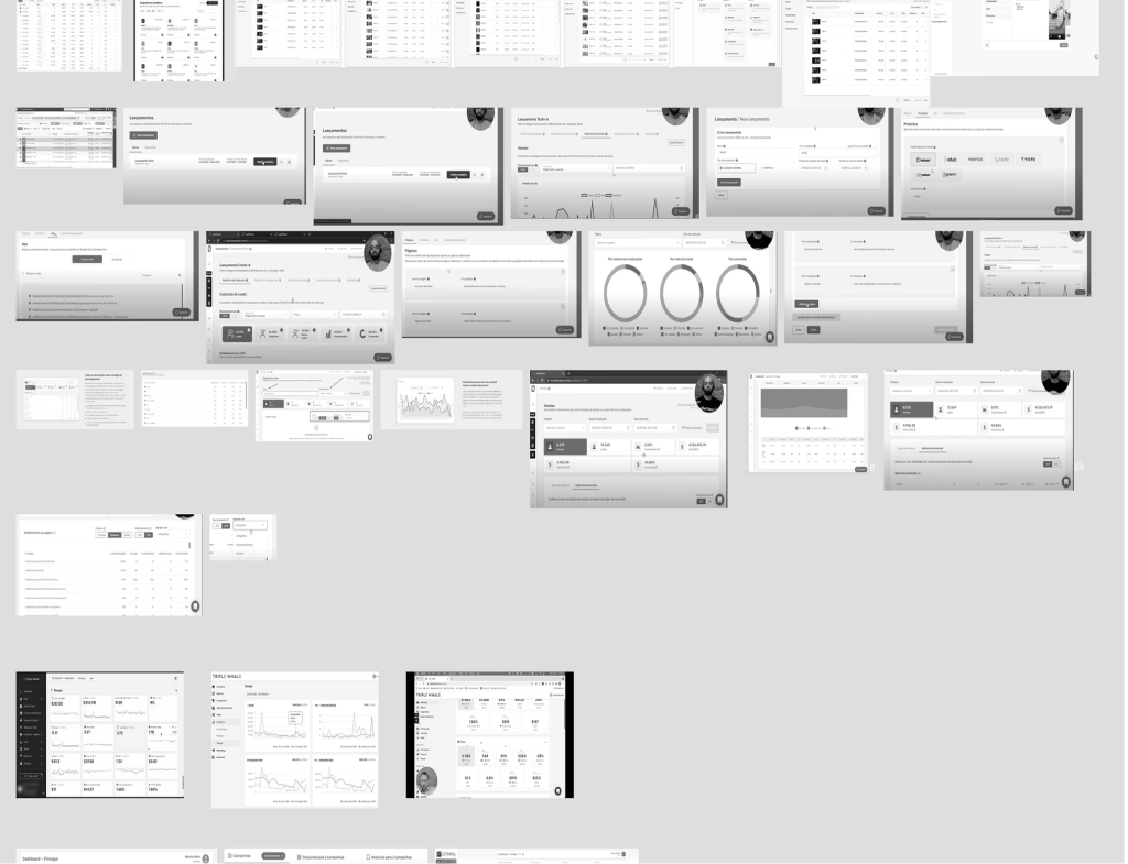
Breaking down market patterns
In parallel, I conducted a competitive analysis of four tools recommended by users (Lead Tracker, UTMify), as well as established platforms like TikTok Ads Manager and Triple Whale.
The goal was to identify hierarchy and visual organisation patterns, as well as metric prioritisation, to understand what users were already familiar with.
I found that the native managers from big tech companies are built for pure data analysts. They are intentionally dense and complex. Ubitracker's strategic value should be exactly the opposite: acting as a "translator" that clears that visual noise.
05 / 09
Approach
Approach
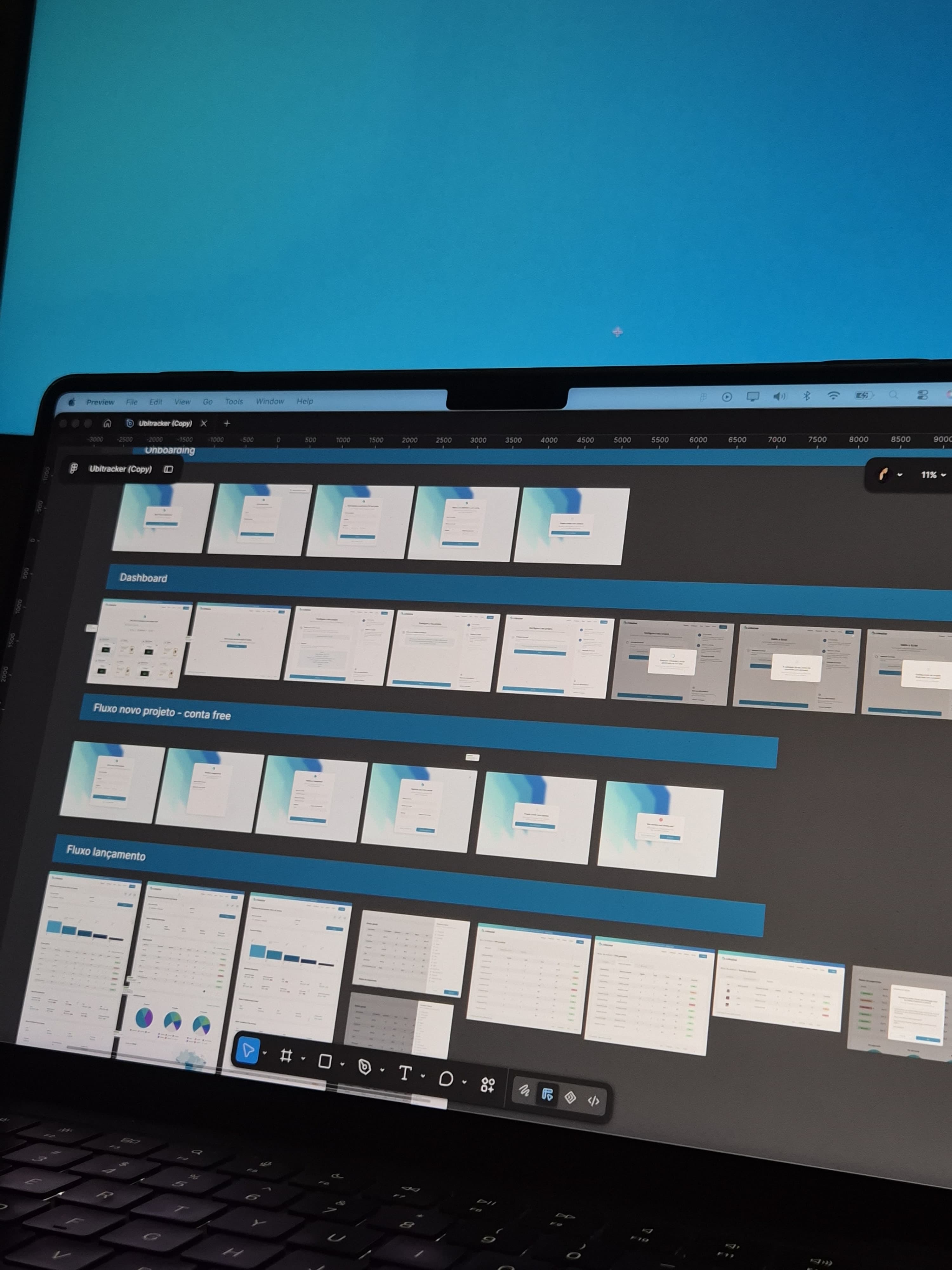
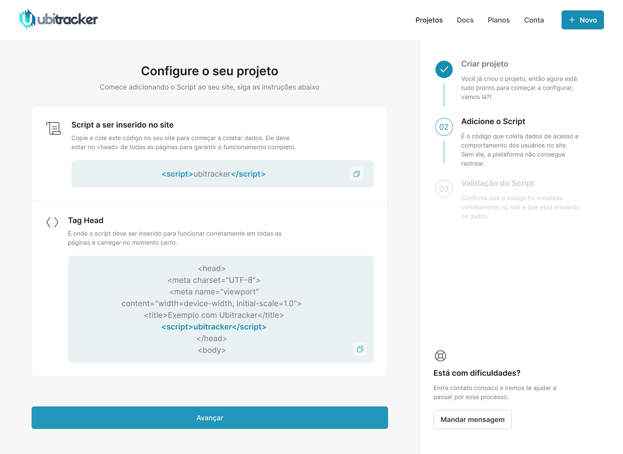
The "Empty Dashboard" ghost
One of the mapped challenges was the initial learning curve. If a less technical user logged in for the first time and faced a completely empty panel — no data, no guidance — frustration would cause early abandonment (churn).
Working with the team's developer, I designed a product-activation strategy: a Guided Onboarding flow. The idea is to hold the user's hand through the first technical steps (like connecting the Facebook API), ensuring they reach their first moment of value without cognitive friction.
06 / 09
Approach
Approach
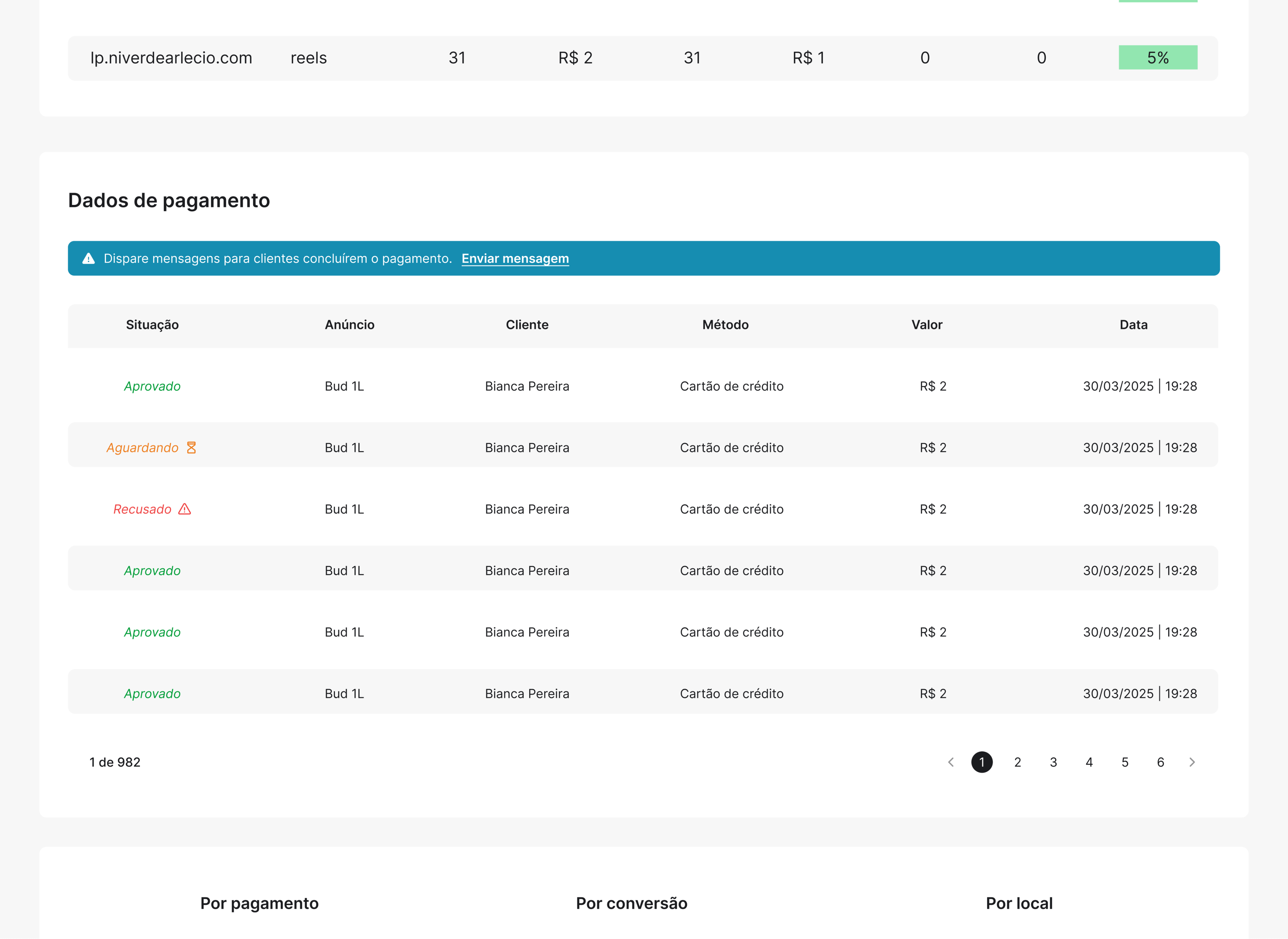
Turning abandoned checkouts into recovered sales
Discovering where users are dropping out of the sales funnel solves only half of the problem — what do you do after finding that hundreds of customers generated a payment but didn't complete it?
In traditional analytics platforms, recovery requires opening an external WhatsApp or email tool, but here we pursued simplicity — no jumping between tools.
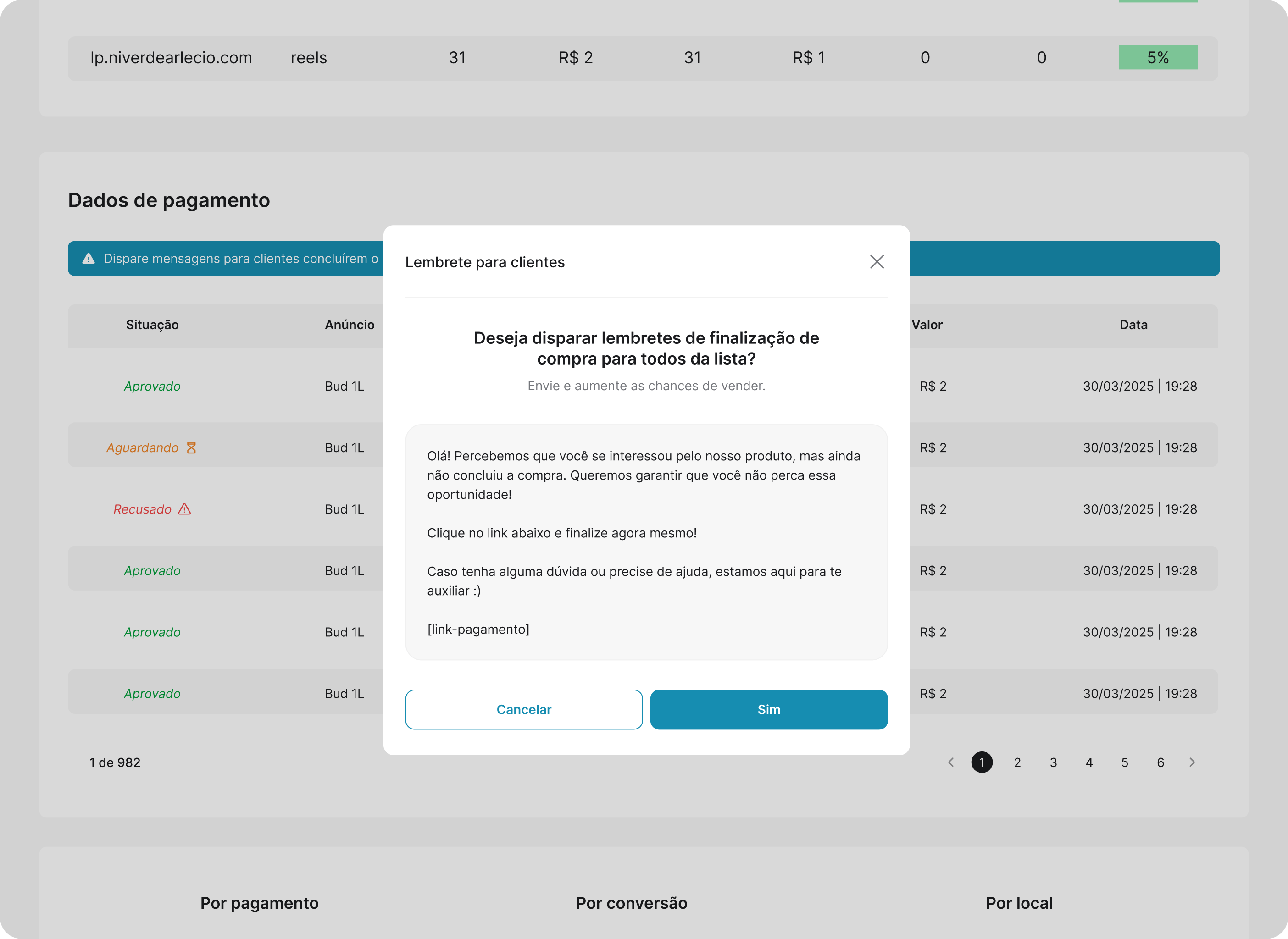
To change this in Ubitracker, the dashboard goes beyond being just observable, now enabling users to take action directly from the Payment Data section via alert banners at the top. Instead of waiting for users to manually filter who hasn't completed payment, the system calculates the current scenario and shows a clear reminder: "Send messages to help customers complete payment".
The alert acts as an urgency trigger at the exact moment the user is analysing the financial section.
Clicking the banner trigger opens a modal flow designed with a preview of the text the end customer will receive, including the dynamic tag [payment-link]. This eliminates the anxiety of sending a wrong message to thousands of leads.
07 / 09
Approach
Approach
Finding the needle in the haystack
Considering that users can create dozens of projects/campaigns simultaneously, how do you organise the operational chaos? A panel that shows everything at once doesn't let users find what they need in seconds.
To combat this information overload, I designed two solutions:
A. Project Findability (Home Screen):
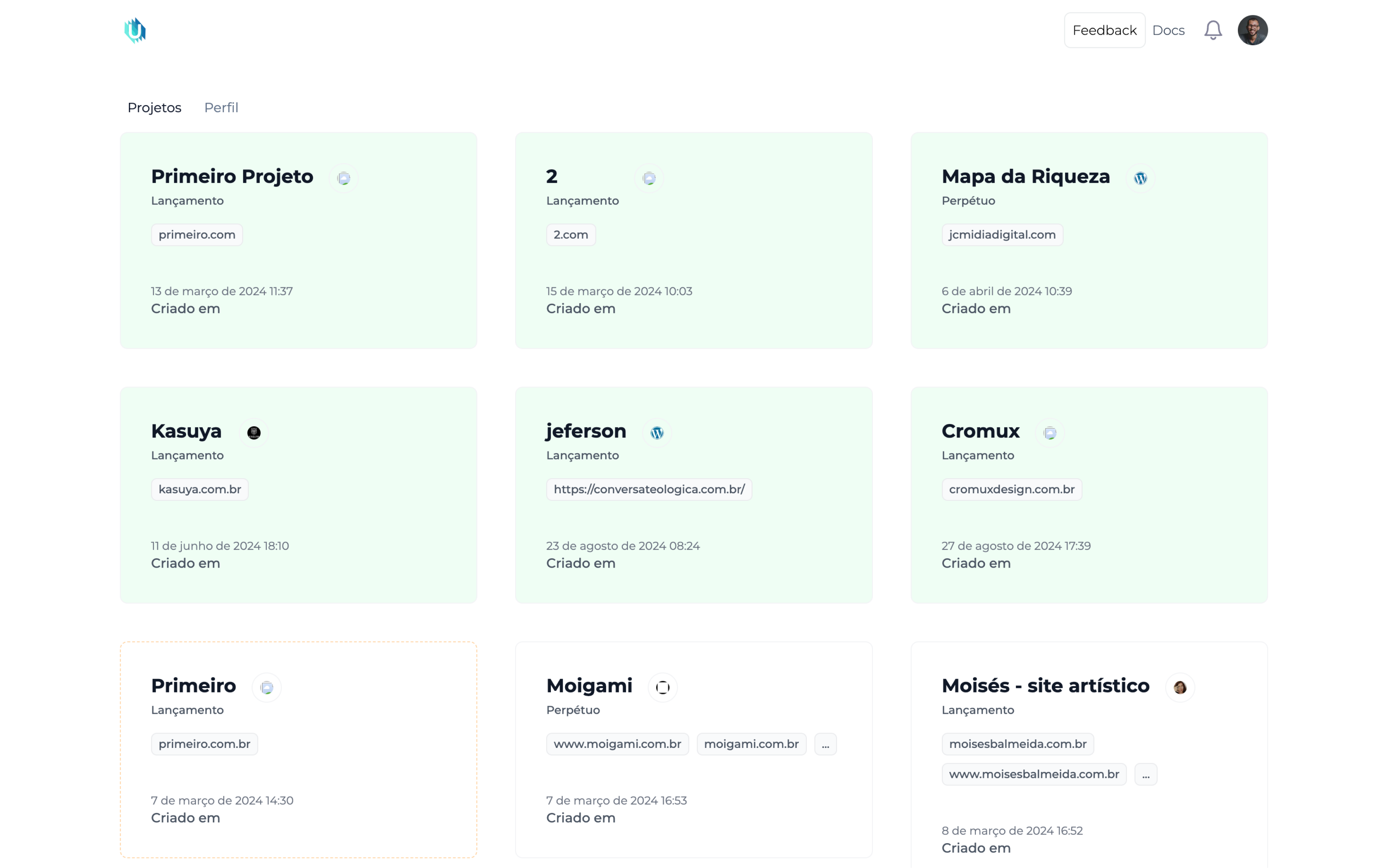
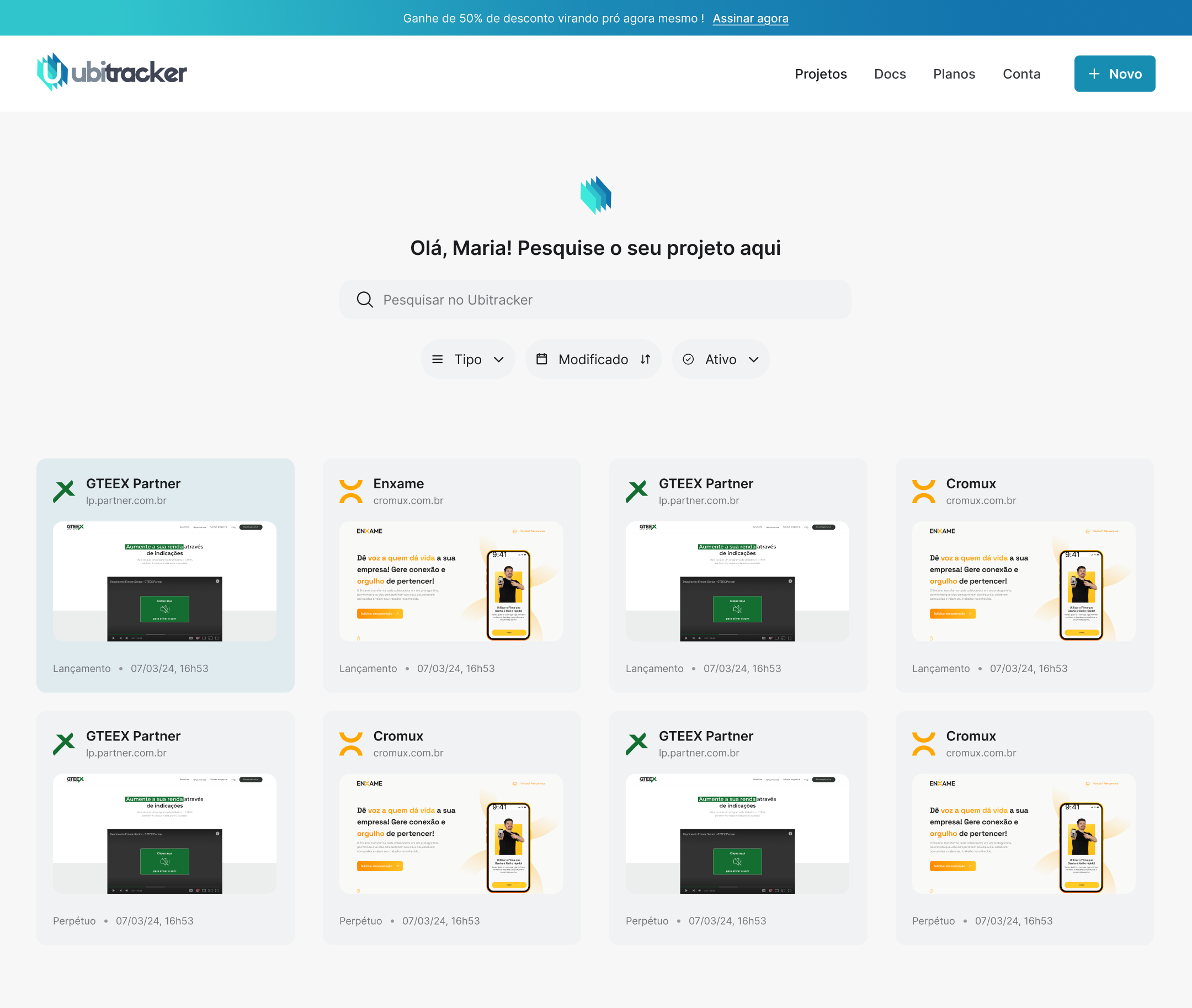
For the home page, I drew inspiration from familiar file management systems like Google Drive. The focus was ensuring that users don't waste energy searching for an active campaign. For that, alongside a search bar, I added quick filters and tag-based sorting by: Type (launch or evergreen), Chronology (modified or created), and Status (active or inactive). This lets users isolate and analyse specific scenarios in a few clicks, keeping the workspace clean.
BeforeAfter
‹›
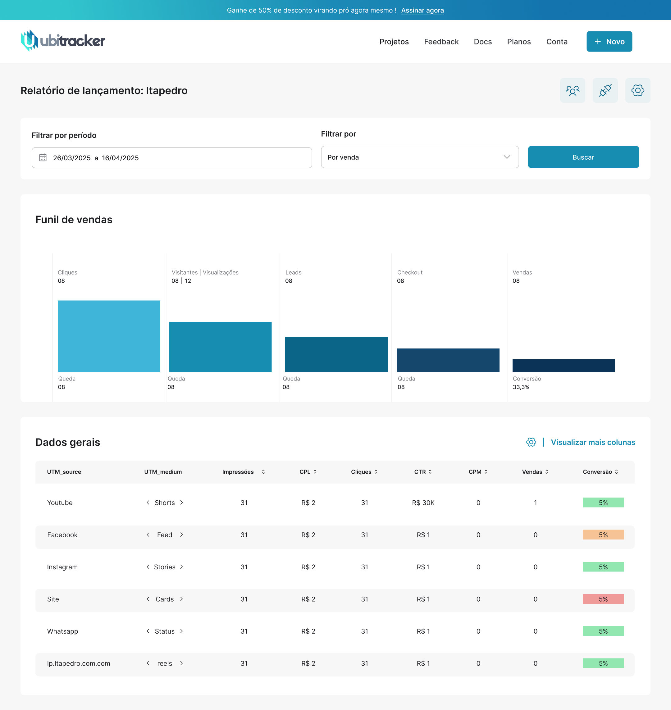
B. Dynamic and Customisable Tables (Column Visibility):
Each user — especially traffic managers — has their own methodology and favourite metrics. What's a priority for one business may not be for another. So instead of forcing a rigid layout, users can choose the data they want to display in the table via a side drawer.
By hiding secondary information, the interface adapts to the user, reducing cognitive stress caused by excess horizontal data on screen.
08 / 09
UI Design
Visual
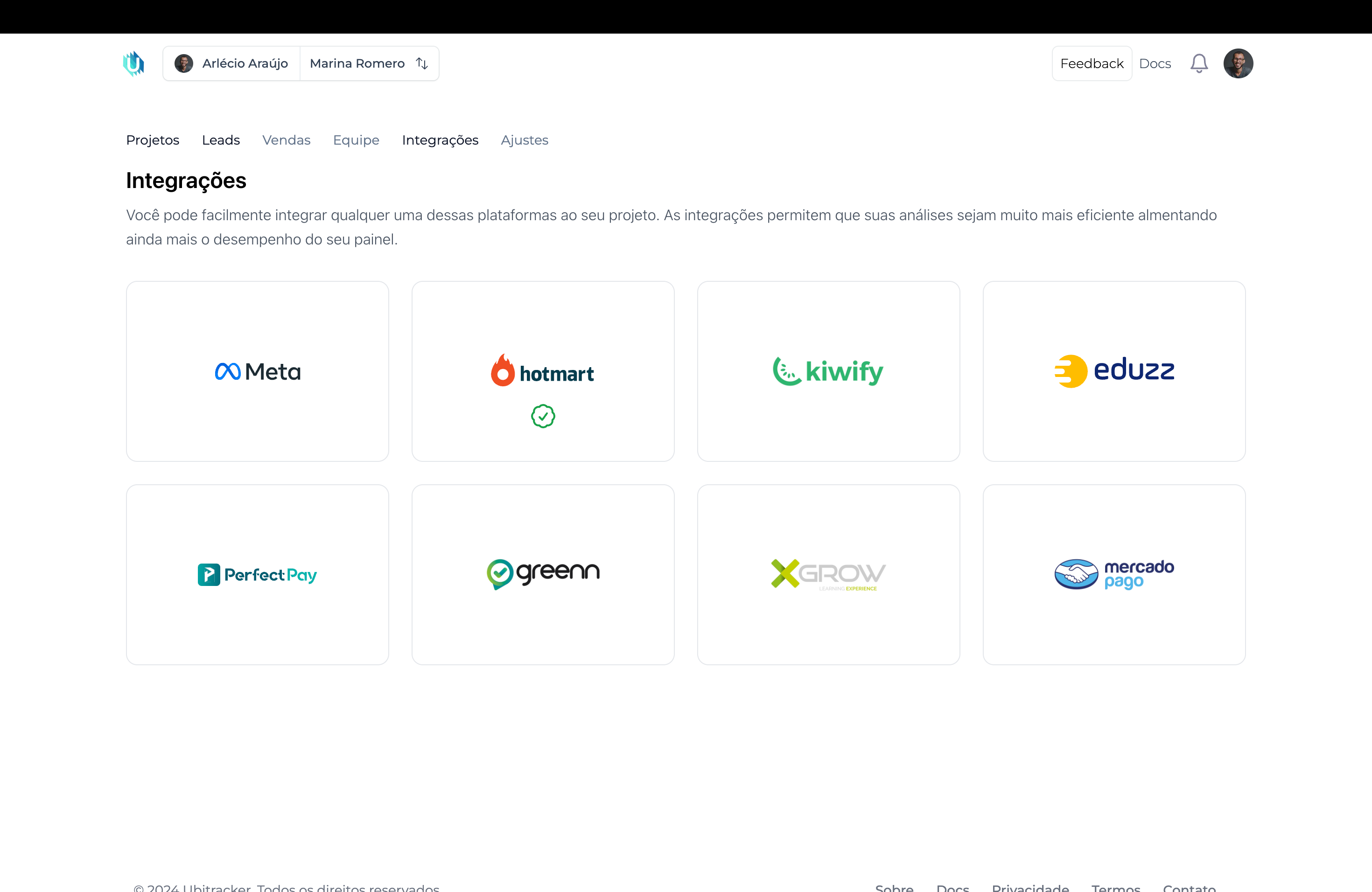
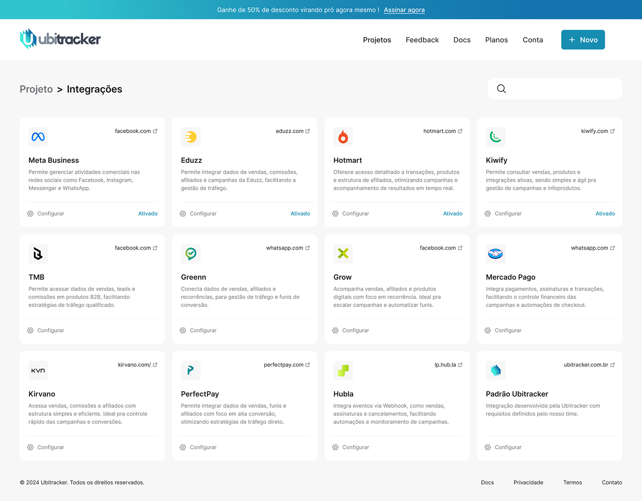
A few more screens from the project
BeforeAfter
‹›
BeforeAfter
‹›
09 / 09
Impact
Impact
Results & Impact
The success of the Ubitracker redesign was measured by our ability to give clear answers to the pain points mapped at the start of the project. Looking at the finished product, the impact falls into three main areas:
◎
Decision 01
Preventing churn
Reduced visual complexity through guided onboarding. The interface became more accessible for both technical users and beginners, preventing early abandonment.
◎
Decision 02
Data → Executable actions
Message dispatch implemented to prevent abandonment at the payment stage. A task that previously required an external tool can now be done in a single click.
◎
Decision 03
Clean and functional structure
The most important data sits at the top of the hierarchy; the dashboard was fully reorganised by data grouping, findability, and improved visualisation.


 BeforeAfter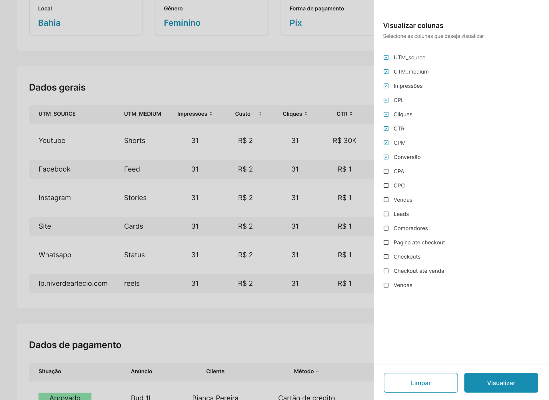
 BeforeAfter
 BeforeAfter